
Learning our way to better navigation.
A navigation redesign succeeded on desktop but underperformed on mobile. That unexpected result prompted a second round of experimentation, with the navigation work ultimately contributing to more than 20% revenue lift.

Navigation people were passing by.
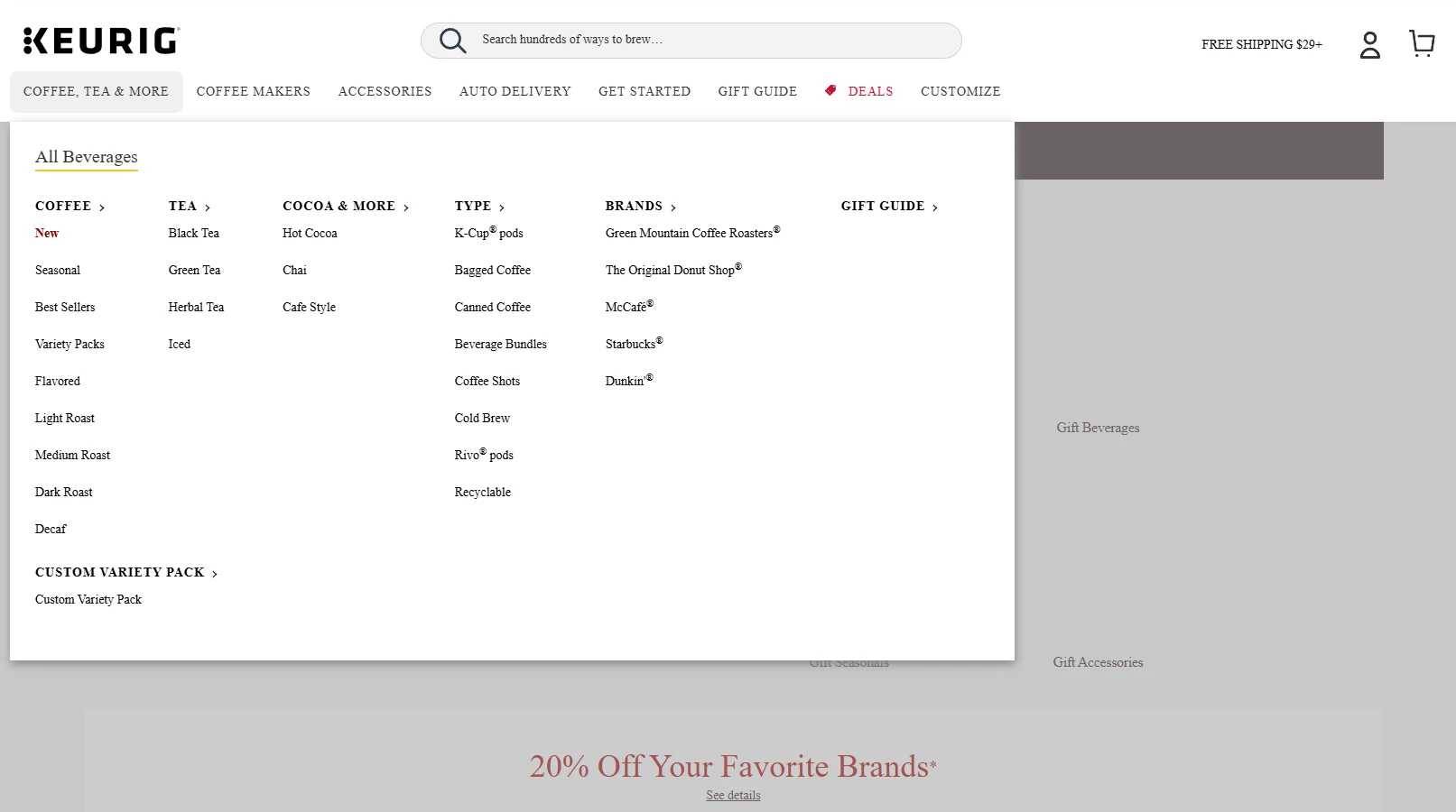
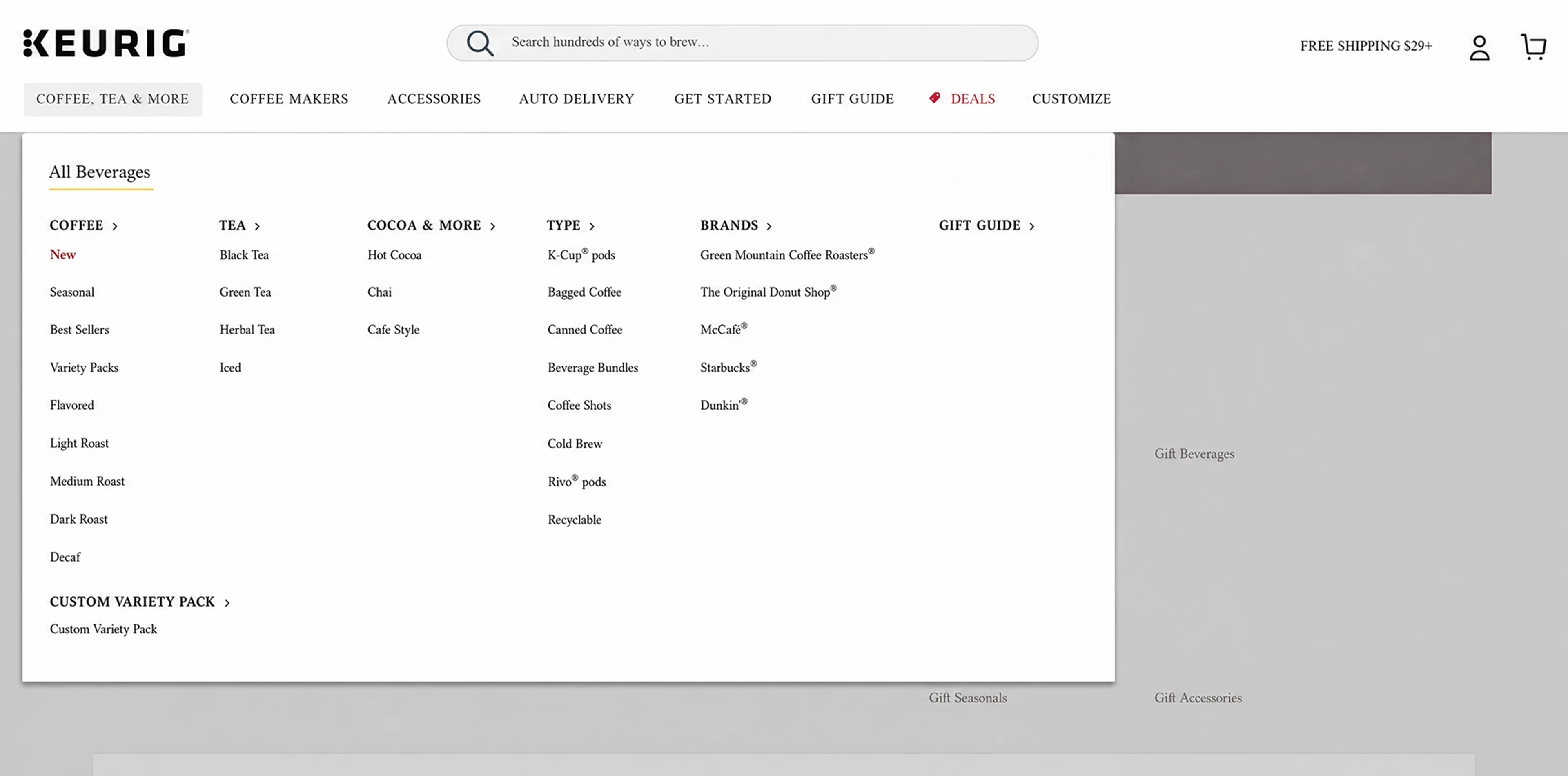
Keurig.com’s navigation exposed customers to large, text-heavy menus. But having those options available did not mean people were using them.
I saw an opportunity to make the navigation easier to understand and more useful to customers. What began as a proposal to introduce imagery became a broader investigation into how navigation needed to work differently on desktop and mobile.
From observe to experiment.
I proposed the navigation redesign, reviewed behavioral evidence, and developed the initial concepts and subsequent mobile explorations.
I worked with Product Management through preliminary testing, live experimentation, and the decisions that followed. When the first mobile result challenged our hypothesis, I returned to the design work with new questions and developed three alternative concepts.
The collaboration included ideas about what to test, not just feedback on the designs. A Product Manager’s suggestion to improve the existing text-based menu became an important direction in the next round.
Available. Easily overlooked.
Screen recordings showed users barely interacting with the existing navigation menus.
The menus presented customers with walls of text. Watching people interact with the site raised a question: could we make those choices easier to recognize and understand?
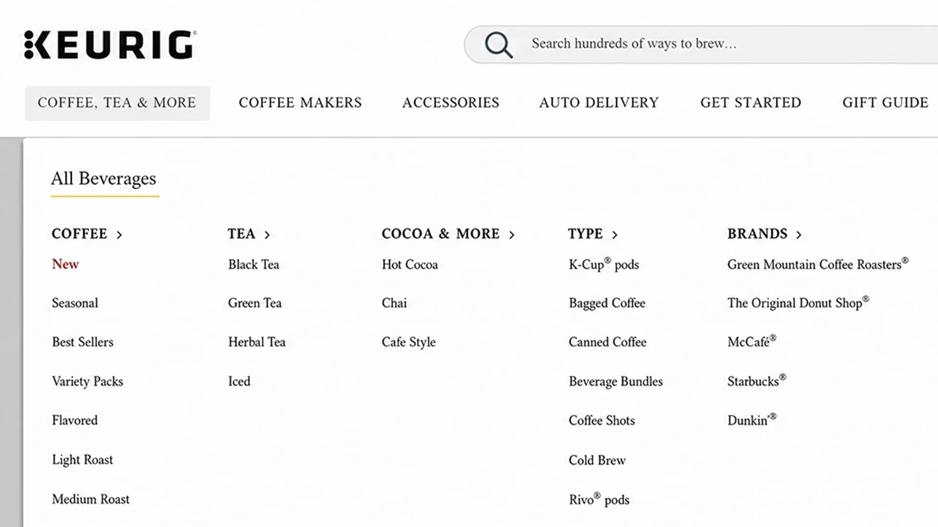
The recordings helped identify an opportunity, but they did not establish why people were passing the menus by. Imagery was a hypothesis to test.
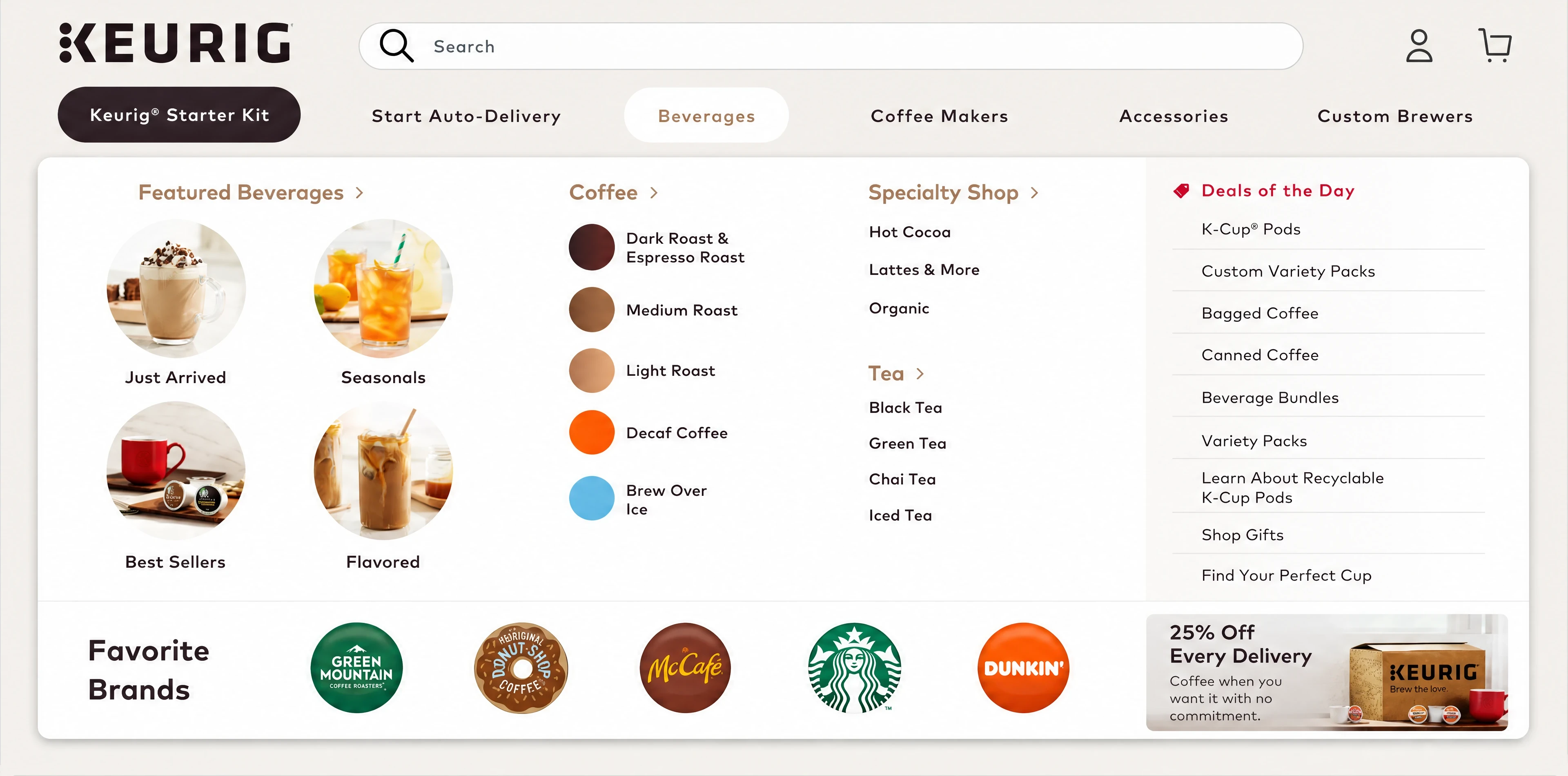
Could imagery make the choices clearer?
I developed navigation concepts that used imagery to help customers understand the categories more quickly.
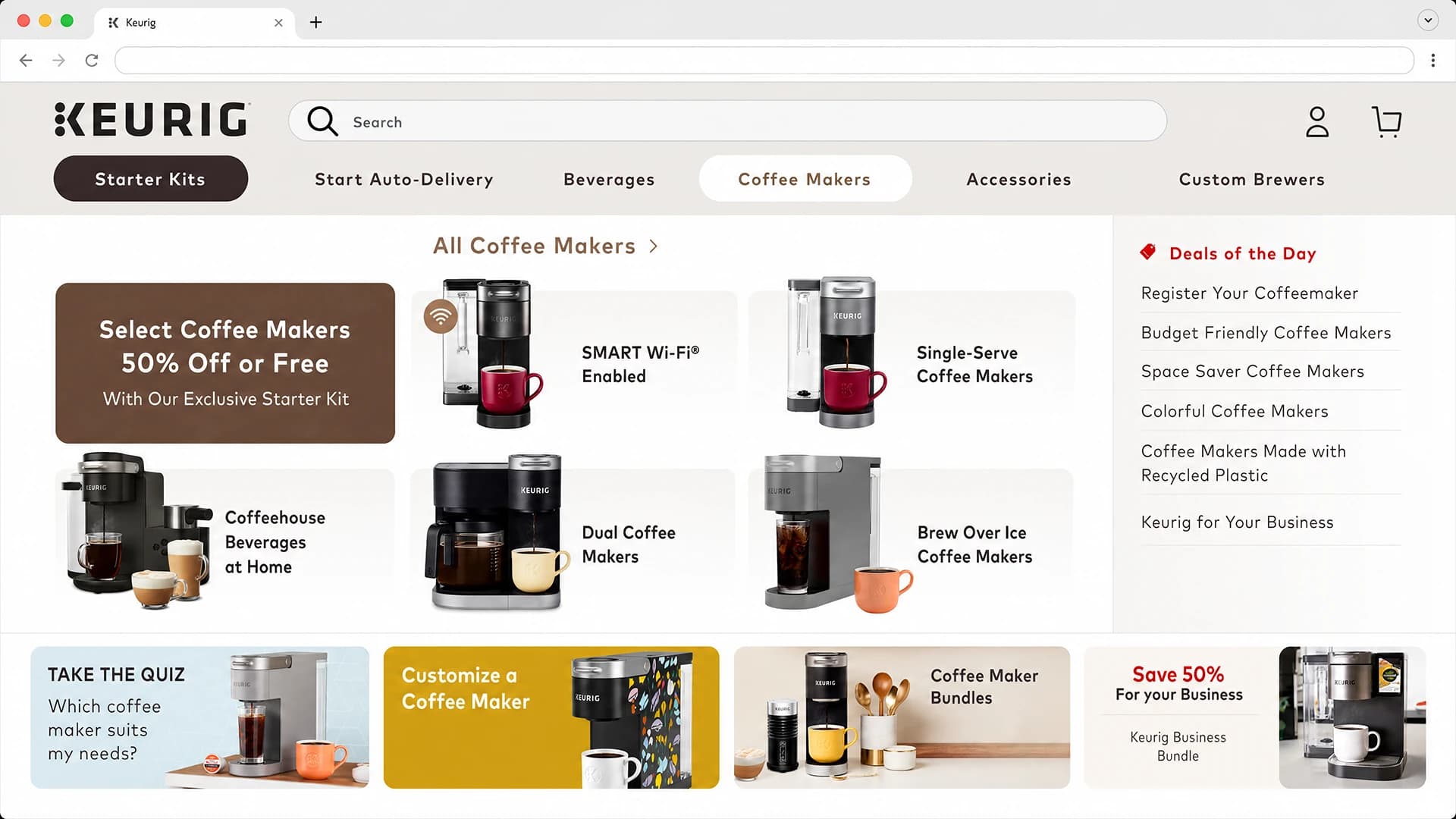
We conducted preliminary testing, then Product proposed launching the redesign as an A/B test against the existing experience. That gave us an opportunity to evaluate the hypothesis through real customer behavior.
Desktop won. Mobile lost.
The visual navigation performed strongly on desktop. On mobile, it performed substantially worse than the original text-based menu.
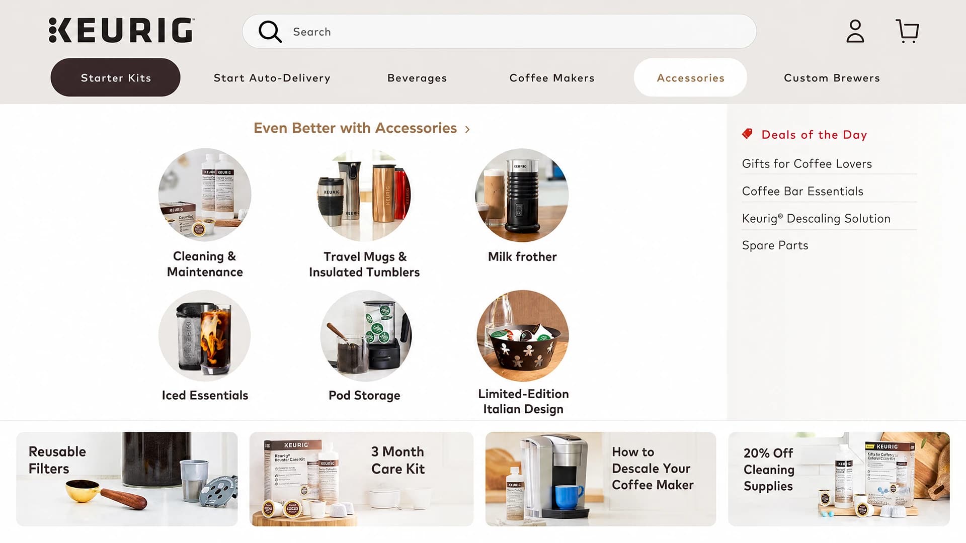
We separated the results by context. We kept the successful desktop direction and turned the mobile redesign off.
The result showed that our initial direction did not work equally well across devices. It did not tell us exactly why, so the next step was to explore alternatives rather than assume we already had the explanation.
Three concepts. A broader question.
I went back to the drawing board and developed three mobile concepts. We selected two to test against the original menu in an A/B/C experiment.
One Product Manager suggested revisiting the text-based navigation while keeping it text-based. Instead of assuming mobile needed imagery, we could preserve the familiar approach and improve its hierarchy and usability.
I explored that suggestion alongside the other mobile directions. It expanded the question from how to make visual navigation work on mobile to what would make mobile navigation work better.

The revised text-based direction proved similarly successful. The results gave us a viable path forward without requiring mobile to follow the desktop approach.
More than 20% revenue lift.
The navigation work ultimately contributed to more than 20% revenue lift.
That outcome came through successive experiments. The first launch identified a strong desktop direction and a mobile approach that needed to change. The next round gave us better mobile alternatives, including an improved text-based menu.

Product and UX both contributed to the hypotheses. Being willing to pursue a colleague’s suggestion helped us find a successful direction beyond the original visual concept.
A failed test can move the work forward.
The disappointing mobile result became one of the most useful parts of the project. It challenged our assumptions while there was still an opportunity to change direction.
Desktop success did not guarantee mobile success. Evaluating those contexts separately allowed us to preserve what worked and revisit what did not.
The project also reinforced the value of treating Product partners as contributors to the design thinking. Their ideas could change what we explored, not simply what we approved.
The goal wasn’t to prove that the original design was right. It was to find the experience that worked.