
From observation to direction.
A usability study of Fidelity’s myCareer experience identified where employees struggled, established a usability baseline, and translated research findings into recommendations for a subsequent redesign.
Understanding the experience before redesigning it.
myCareer offered employees information and tools for exploring career opportunities, but the experience needed to be evaluated through the people using it.
The study examined how employees understood and navigated myCareer, where they encountered difficulty, and which parts of the experience they found useful. The goal was to turn those observations into a clearer set of design priorities.
This case study focuses on the research itself. A separate portfolio project covers the redesign informed by these findings.
Planning and executing the study.
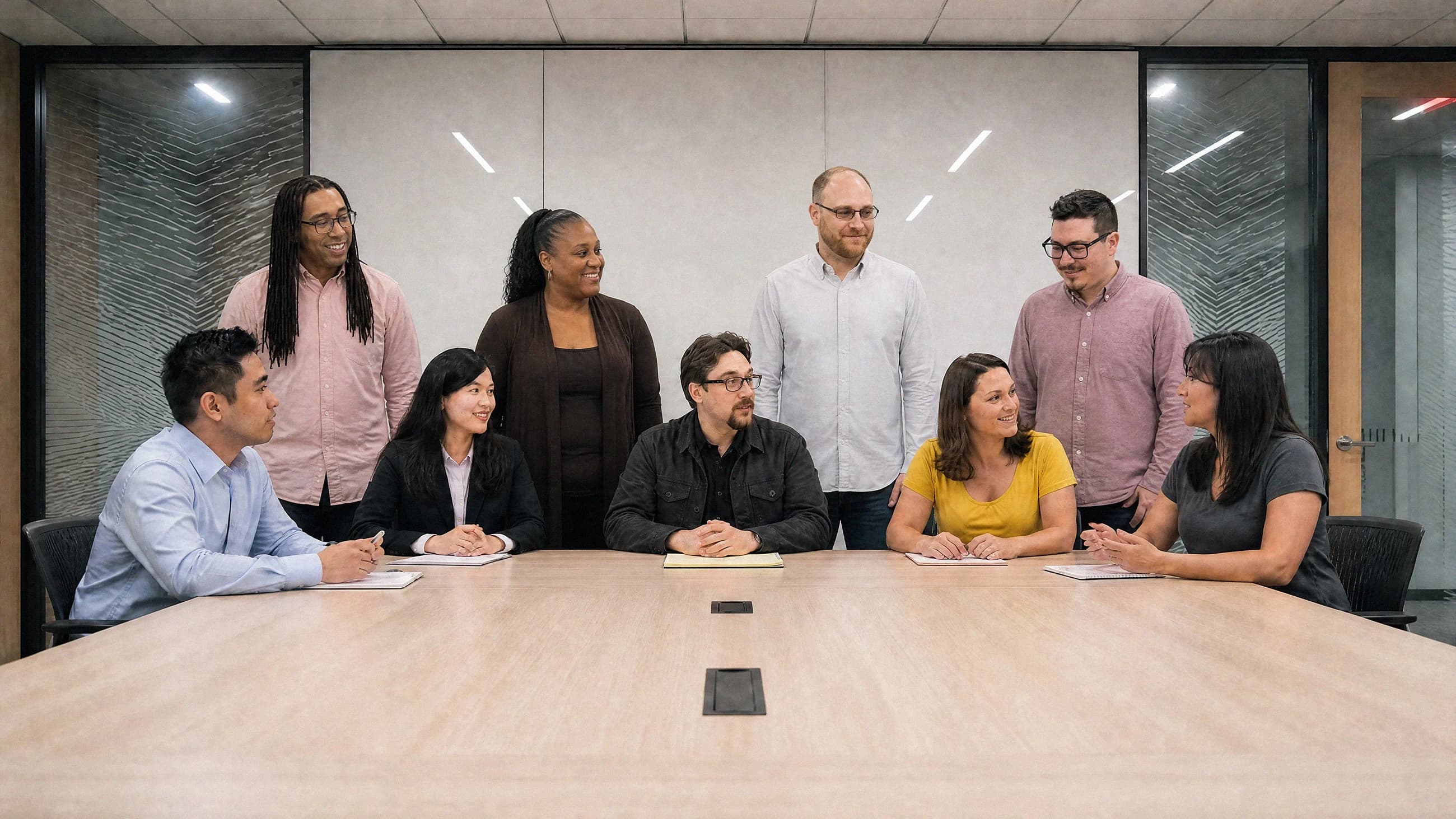
I planned the research, and Stefanie Young and I executed it under the Fidelity UXR umbrella.
My contribution was to help establish a structured way to evaluate the experience, observe how participants worked through the tasks, and turn the resulting evidence into findings and recommendations.
Research is an important part of my product-design practice. I do not position myself as a dedicated UX researcher, but I am familiar with the methods and understand the importance of using evidence to guide design decisions.
Where was the experience breaking down?
The product contained information users valued, but that did not necessarily mean they could understand or use the experience effectively.
The research needed to distinguish between the value of the underlying career-planning information and the usability of the interface presenting it. We wanted to understand where users became confused, what they expected to happen, and which interactions prevented them from making progress.
Observe, record, and synthesize.
The study combined task-based observation with qualitative feedback and a standardized usability measure.
Nine participants from different Fidelity roles took part in the study. The methodology included background questions, task-based testing, think-aloud observations, moderator and observer notes, screen and audio recordings, and the System Usability Scale.
The research was designed to capture more than whether a participant completed a task. We also wanted to understand their expectations, moments of hesitation, confusion, and reactions to the experience. The tasks were repeated with different users and mapped until an actionable pattern emerged.
Turning observations into patterns.
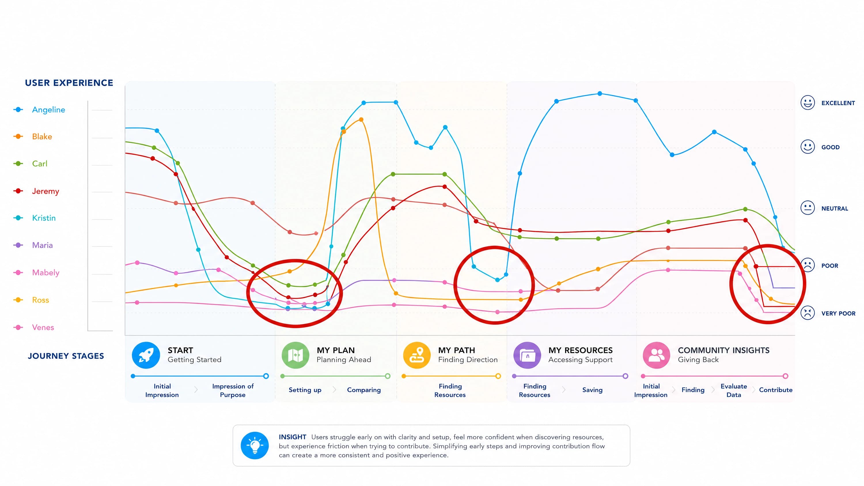
The journey map helped organize individual observations into a clearer picture of where the experience worked and where it created friction.
Participants recognized value in the information available through myCareer, but the study also revealed confusion around the product’s purpose, navigation, career comparisons, resources, and interaction conventions.
The journey map brought those observations together, highlighting recurring failure points as well as areas participants found useful. This helped move the discussion from individual comments toward patterns the team could act on.
The recommendations addressed several of those patterns: clarifying the purpose of the application, simplifying career comparisons, making controls easier to understand, and presenting detailed chart information more progressively.
A baseline and a direction forward.
The study established a measurable usability baseline and produced recommendations that informed the subsequent redesign.
myCareer received a System Usability Scale score of 62.6, below the deck’s stated average of 68. The score provided a quantitative baseline alongside the qualitative findings.
The research identified specific usability problems and translated them into proposed design changes. Those findings became the foundation for a separate redesign project.
This case study does not claim that the research itself improved the SUS score or that every recommendation shipped. Those outcomes belong to the subsequent redesign and should be evaluated separately.
Diagrams showing results mapped from 9 user testing sessiosn.
The journey map helped organize individual observations into a clearer picture of where the experience worked and where it created friction.
Research makes design decisions more accountable.
The value of the study was not simply collecting feedback, but creating a clearer basis for deciding what to change.
The project reinforced the importance of observing real users rather than relying only on assumptions about how an interface should work. It also demonstrated how qualitative findings and a standardized measure can complement one another.
For me, the lasting lesson was that research is most useful when it connects directly to design decisions. The findings gave the team a more grounded starting point for the redesign and a baseline against which future improvements could be evaluated.